---
title: Use CSS Grid to stack items
author: Victor Cobos
tags: CSS, TailwindCSS, Design
published_at: '2024-03-27T11:53:00+01:00'
updated_at: '2024-07-24T11:26:28+02:00'
canonical_url: https://www.dotruby.com/articles/use-css-grid-to-stack-items
---
# Use CSS Grid to stack items
Discover how to use CSS Grid to stack items efficiently without relying on absolute positioning. This guide explains how to position elements within the same column and row, using both CSS and TailwindCSS, to create flexible and responsive layouts.
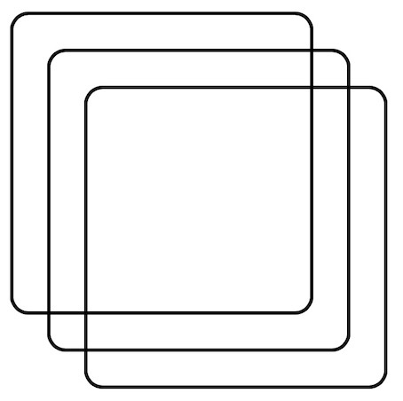
Skip `position: absolute;` for overlapping items. Use `display: grid;` and then position them in the same column + row.
🎩✨ Grid respects content size, a neat trick lost with absolute positioning.
 ```html
```
[Codepen demo](https://codepen.io/elalemanyo/pen/mdgMwVO)
Alternatively, the shorthand method `grid-area` property to achieve the same result with more concise syntax. By setting `grid-area: 1 / 1;` on each item you wish to stack. Since the end lines for both rows and columns are not specified, they default to auto, which means the item will span one row, and one column from its starting position.
If you prefer to use TailwindCSS, that's no problem:
```html
```
[TailwindCSS demo](https://play.tailwindcss.com/AVT5sy365d)
```html
```
[Codepen demo](https://codepen.io/elalemanyo/pen/mdgMwVO)
Alternatively, the shorthand method `grid-area` property to achieve the same result with more concise syntax. By setting `grid-area: 1 / 1;` on each item you wish to stack. Since the end lines for both rows and columns are not specified, they default to auto, which means the item will span one row, and one column from its starting position.
If you prefer to use TailwindCSS, that's no problem:
```html
```
[TailwindCSS demo](https://play.tailwindcss.com/AVT5sy365d)